Paper Cut Effect in Illustrator

Daniel Scott
@dan
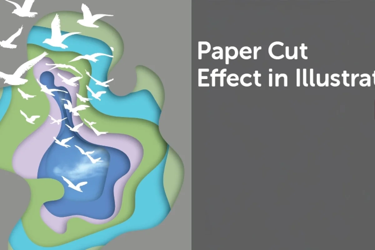
In this post, we are exploring an amazing effect that can be applied to a wide range of artwork — the Paper cut effect! This technique gives illustrations the detail of depth, texture, and shadow using abstract or real shapes. The paper cut effect is perfect for greeting cards, decorations, product packaging, storybooks for children, marketing materials, and so much more. Get inspired and create brilliant art in minutes!
This post is based on my recently updated Illustrator Advanced course. When you become a BYOL member, you gain access to this course as well as my 30+ additional courses on Photoshop, Lightroom, InDesign, Figma, and more. As a BYOL member you will also enjoy personalized support, earn certificates, and tackle exciting community challenges. Head here to sign-up!
Let’s start chopping!
How to Make a Paper Cut Effect in Illustrator
Let’s begin this quick and easy step-by-step guide with a new blank document. You can set it with the size and settings you prefer, feel free to sketch some art on your notebook to get those creative juices flowing, and when you are ready, we can start drawing!
I’ll use the Pencil tool to create my abstract blobs. You can go for the Pen or Curvature tools, the Blob brush, you decide what’s best and draw anything you like.
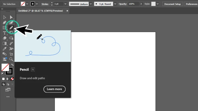
Drawing with the pencil tool is great if you are using a tablet and stylus. Mouse can be a bit tricky, but you’ll do fine!
Next, we double-click the Pencil tool on the left toolbar to open the Pencil Tool Options panel. Adjust the Fidelity slider from Accurate to Smooth.
Accurate creates a path exactly like it is drawn. Smooth automatically softens curves and corners to make the path smooth and organic.
I’ll drag the slider all the way to Smooth to draw some really nice curves and avoid sharp angles. We click OK to move on to the fun stuff!
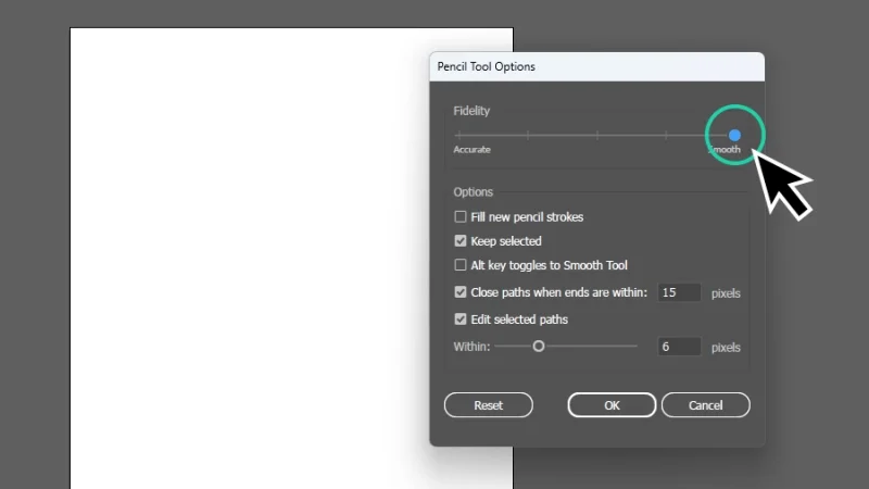
Adjust drawing Fidelity levels for sharp details or smooth curves and corners.
Let’s click and hold the left mouse button to draw our first blob. We can go absolutely freehand on this one, create any shape we want, abstract or not, only making sure we end up with a closed path. You will know the path will close when the Pencil tool icon asterisk changes to a small circle when both path start and end connect.
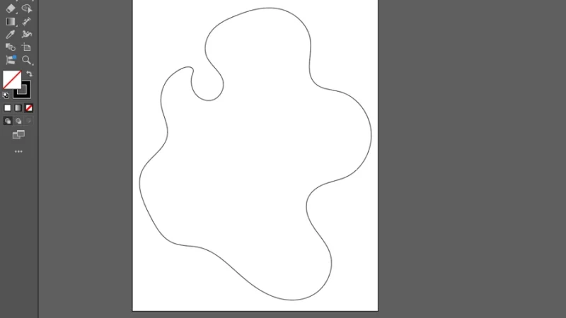
This blob reminds me of an old Robin Williams movie…
Let’s draw a few more freehand shapes with the Pencil tool, I’ll create a total of six different blobs. Make sure that each shape is a bit smaller than the previous one and try to overlap some of the lines to help us create a cool effect a few steps down this tutorial. You’ll love it! When we are done with drawing, our artwork should look a bit like the one in the image below:
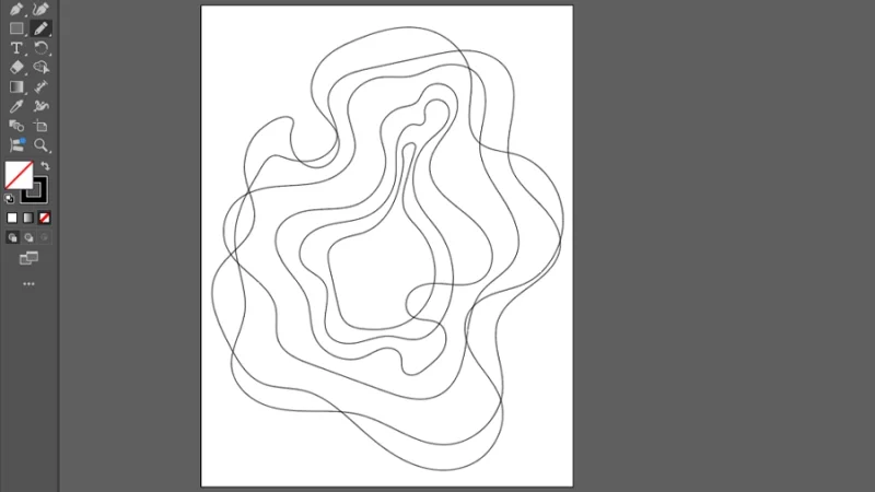
I really like these overlapping curves, they have this kind of hypnotizing, Alice in Wonderland dreamy style.
We have drawn the basic shapes. Let’s move on to set up all the pieces for our paper cut puzzle-ish effect. We will be combining each abstract blob with a rectangle shape and framing them to match our artboard, using Compound Path.
Next step: separating all the blobs outside our artboard and have them organized, as if we are actually preparing a puzzle to be assembled. You know what I mean? Separating corner and side pieces, organizing the inner pieces by color or detail, that preparation stage is as relaxing and fun as putting them all together. If you love puzzles, of course. If you don’t, skip the metaphor and move on.
Arrange them in the workspace outside the artboard. I changed the strokes to white so they are visible for this part, but you can keep them black or any other color. Make sure you remember the size order, it will be helpful along the way.
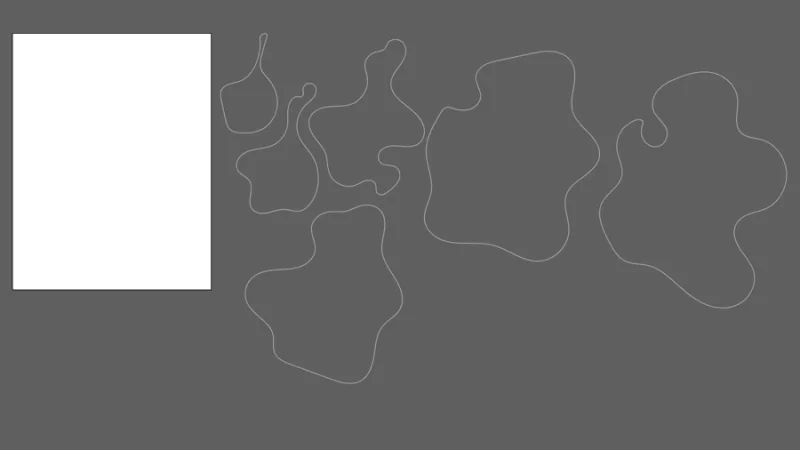
This is just like a table full of puzzle pieces waiting to be put together to create an image. Fun!
Next, we create a new rectangle shape, using the Rectangle tool, with exactly the same dimensions as the artboard. Give it any Fill color, it’s not important right now, we will be looking into color palettes in a paragraph or two. Select the smaller blob, click and drag it to the center of the rectangle. Repeat for all the other blobs. We don’t have these pairs together. Let’s have a quick look at colors.
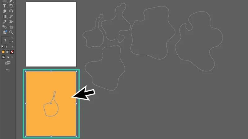
This is the first of our puzzle pieces. Let’s repeat this step for all blobs.
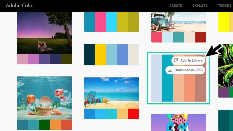
Adobe Color is a great place to search for and set up color themes (or color palettes). Click on Explore at the top menu and type in the search bar the kind of imagery or theme you want to inspire your collection of colors. I typed something as simple as “beach” and hit the Enter key on my keyboard. Adobe Color replies with a vast set of color palettes inspired on beach images and graphics. Cool, huh? When we hover the mouse cursor over these collections, we are given two choices:
Download as JPEG, to save, import and sample from it in the future.
Add To Library to store this palette as a Color Theme and sample directly from your Libraries on multiple Adobe apps, like Photoshop or InDesign. Design consistency at 100% level!
I’ll pick Add To Library and show you how we can bring color to our color pieces from there.
Saving color palettes from Adobe color is easy, inspiring, and fun! Give it a try!
Back in our artwork, let’s open the Libraries panel. We can find it in the top menu bar, clicking on Window and selecting Libraries, or on the Properties panel to the right of our workspace. Browse Libraries to locate the Color Theme we’ve added from Adobe Color. Once we have it, we only need two actions to start making magic! One, select the first rectangle (and only the rectangle) with the smallest blob. Two, click on the Color Theme’s first color swatch, the light blue. It’s done! The rectangle is now filled with that first color.
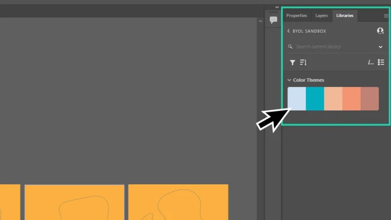
How many hours have you spent struggling with color combinations and making color palettes harmonized? Color themes are your new besties!
Repeat for the remaining rectangles, picking a different color on each step. We can try different combinations, like moving from the darker to the lighter tone, randomizing color order, we can try everything with abstract pieces like these. It’s all about creativity and experimenting new styles.
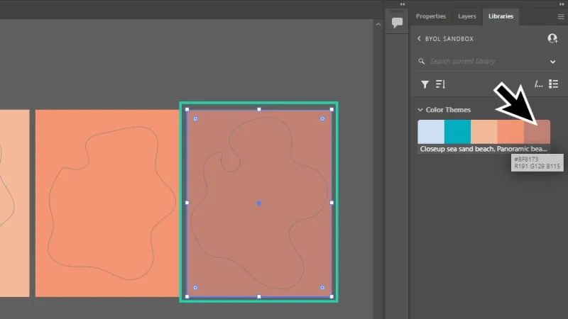
Illustrator and Libraries make the perfect tag-team for productivity and consistency. Use Libraries to streamline your work.
Time to start cutting! There’s nothing complicated to this, you can do it with your eyes closed - or at least one of them, anyway. Once again, two basic steps:
Select both rectangle and blob shape.
Make a Compound Path. We can right-click the selected shapes and pick Make Compound Path from the menu options. Another way to do it is clicking Object on the top menu bar, hover Compound Path with the mouse cursor, and then select Make. Finally, my favorite: the shortcut keys Command + 8 on a Mac or Control + 8 on a PC. Both shapes are combined into a single object and the blob gets cut from the selection.
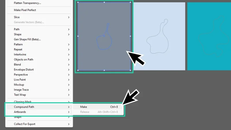
Compound Path combines multiple paths or shapes into a single object.
How awesome is this? One precision cut puzzle piece with just a couple of clicks! Repeat the previous step for the remaining pairs of rectangles and blobs and we are riding at full speed, now!
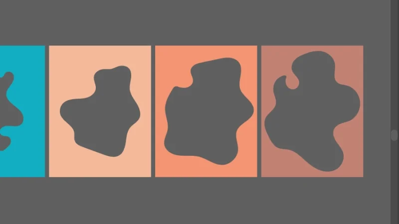
One swiss cheese board coming up! 🙂
Next, align all the pieces with top and bottom edges. With all of them selected, we click the Horizontal Align Center button to align them all up horizontally and form this incredible visual effect. There’s a small hole left in the middle of this composition, we make a cool window out of it.
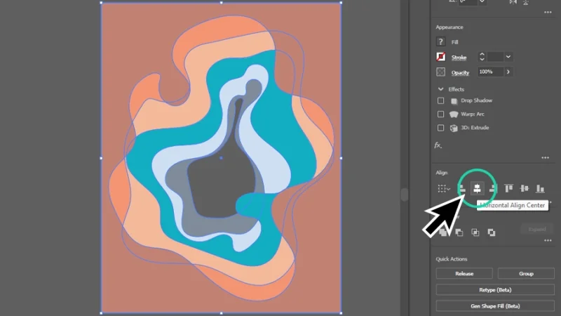
Wow, this looks great! But it still doesn’t look much like a paper cut artwork. I wonder what’s missing?
Bonus step
This is an optional trick to add a special look to our artwork. You don’t have to follow it if you are taking your illustration in some other direction. If you are curious, keep on reading, if you are excited with your own creation, skip to the next step!
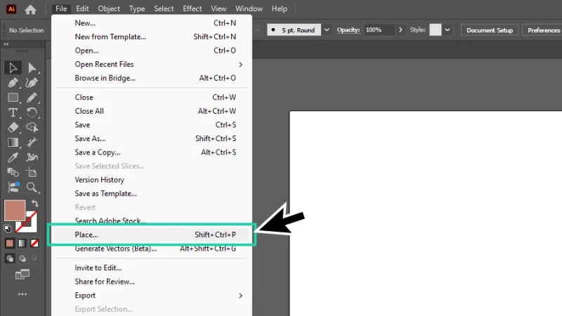
Let’s place a new image on the artboard. We can do it by clicking File and then Place… from the menu. Next, we browse our folders, select the image, and click the Place button to import it into the file.
I’ll add a hint of blue sky to our design. Hope it looks good!
Resize the new image and center it in the artboard, to set it as a background sky that will peek through that gap left in the middle of the compound path artwork. This will give it a whole new depth look (hopefully)!
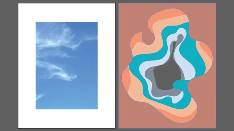
Our blue sky is in place, time to bring the abstract paper cut artwork into the artboard.
Now it’s time for the final touch that will give our project that awesome 3D feel and visual texture and complexity. Can you guess what it is? Exactly, shadows!
With all shapes selected, click on Effect up in the top menu bar, hover the mouse cursor over Stylize, and then select Drop Shadow...
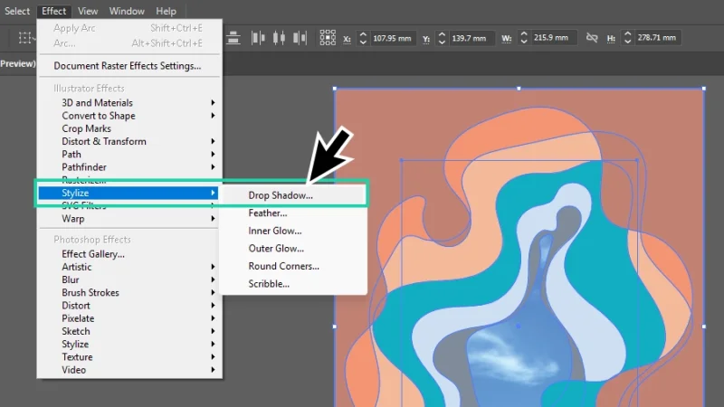
It’s shadow time! Get ready to be amazed!
Inside the Drop Shadow settings window, we can play around the Blending Modes, Opacity value, X Offset size (left or right movement) and Y Offset size(up or down movement), Blur intensity, Shadow color, and Darkness intensity.
Pro tip: My advice is always the same, concerning shadows: keep them subtle, natural, and proportional to the shapes and depth effect you are aiming for. That’s how professionals do it. Pick up a flashlight or take a walk outside. Have a look at how objects, people, everything around you interacts with light and casts a shadow. What do those shadows look like? When are they more solid or more blurry, more intense or less visible? Train your eyes and you can’t go wrong!
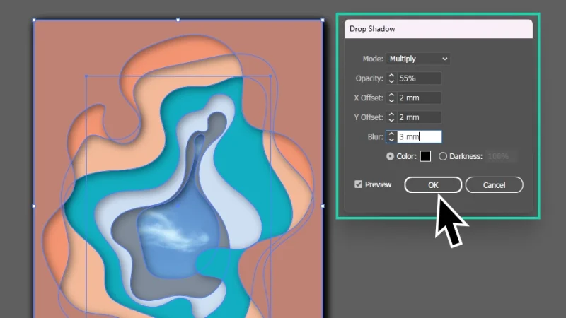
Ah, we were missing those awesome shadows! Can you see those layers of cut paper now? Awesome!
Another Pro Tip: Working with complex shapes and applying raster (pixel-based) effects, like drop shadows, to vector designs in Illustrator can sometimes demand a lot from your computer’s resources. This is a basic artwork example, but adding more layers and more effects may eventually slow your machine down. There is a trick to help you with this issue. If your computer is struggling to process effects and save changes, there is a risk that it will crash and your work (or at least part of it) can be lost. That is never a good thing. You can make it easier by adjusting your effects resolution while you are designing. Go to Effect and select Document Raster Effects Settings from the menu.
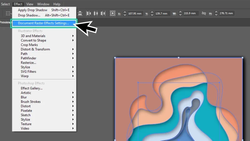
Document Raster Effects Settings will help you optimize your computer’s performance.
Inside the settings window, click on the Resolution drop-box and select the lowest resolution available: that’s 72ppi. If you are designing for screens, 150ppi should be enough as final resolution, and 300ppi is the right option for printing. If your computer runs smoothly on 150ppi, keep it that way. If 300 or 150 are too much, lowering resolution to 72ppi should make processing lighter on your machine and faster. Once you complete the design, come back to this window, and increase resolution to the right value before exporting your artwork.
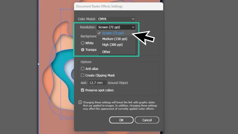
Lower resolution settings while designing your artwork and applying raster effects. Pixels can be small, but they carry a lot of weight!
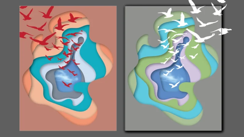
Yet another Pro Tip: Our paper cut artwork is almost complete. We can play more with the art colors and the incredible AI-based Generative Recolor tool. With all shapes selected, click on Recolor in the Properties panel to the right or go to Edit on the top menu bar, hover over Edit Colors and then select Generative Recolor.
Inside the Recolor panel, click on the Generative Recolor tab, type a brief description inside the Prompt field, something like “blue sky” or “pepperoni pizza”, click Generate and let Illustrator do its magic. Click on any Variation you prefer, or ask Illustrator AI to Generate a new set, and your artwork is recolored with a brand new color harmony. Super cool! Remember that generating features spend your limited Generative Credits, always check your Adobe account to verify how many monthly generations you get with your subscription.
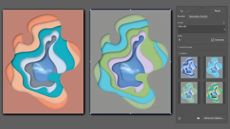
Different colors can bring new layers of meaning and visual impact to your artwork. Explore as many options as you can!
And There We Have it!
Alright! What do you think about this effect? I’d love to see what you did! Share your artwork on BYOL social media!
This was a fun blog post to write! I hope you enjoyed this tutorial and that you will consider joining us at Bring Your Own Laptop to learn even more about Illustrator, from the basics all the way to more advanced level techniques and effects.
What’s Next?
To go deeper with Illustrator, join BYOL and you will gain access to my Illustrator Essentials and Illustrator Advanced courses as well as my 30+ additional courses on Photoshop, Lightroom, InDesign, Figma, and more. As a BYOL member you will also enjoy personalized support, earn certificates, and tackle exciting community challenges. Head here to sign-up!
See you in class! – Dan
Popular posts
Adobe MAX 2025 - File Download
Daniel Scott
Modeling Shortcuts in Blender
Daniel Scott
Plugins in Illustrator
Daniel Scott
How to Straighten the Horizon in Photoshop
Daniel Scott
Go from zero to design hero with our awesome courses!


- Powered by Marvin
- Terms of use
- Privacy policy
- Cookie policy
-
- © Bring your Own Laptop Ltd 2026